2 tbsp. line art
1 cup white space
A dash of colour
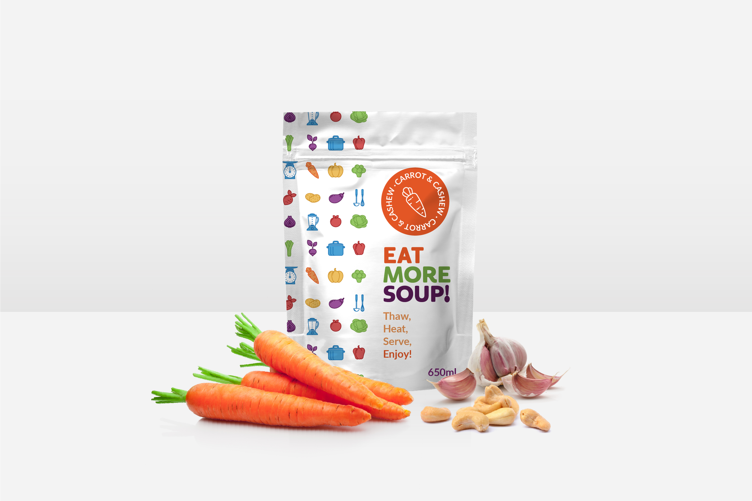
The branding and packaging of Eat More Soup! was designed to highlight its natural ingredients, stand out on the shelf, and celebrate the fun of being in the kitchen. The visual identity is anchored by a colour palette that walks a line between earthy and vibrant. The simple illustrations and ample white space create a sense of crisp, fresh, natural ingredients without leaning on traditional food photography. The overall aesthetic creates an inviting energy that feels clean, authentic, fun, and healthy.
Brand Identity / Logo / Packaging Design


